1. They made it a lighter skin color, made it thinner as well.
2. They made her legs skinnier, lifted her butt, made her legs longer, made her skinnier.
3. They took her fat away, made her taller, made her butt bigger.
4. Yes, it is done to make people look good.
5. Yes, if someone totally changes the face and body completely.
7. Fashion photography is especially about fashion. Photo journalism can be about anything.
8. Fashion is connected to reality because fashion is a part of everyday life. As well as Sports Photography, it links to reality because you always see sports happening.
9. I think you are showing us these videos because we need to see what really happens behind the scenes.
10. Girls always want to look the best.
Monday, December 14, 2015
Thursday, December 10, 2015
Friday, December 4, 2015
Portraits and Self Portraits
1. I think the 3 best portrait taking tips are Play with Eye Contact, Mirroring something, Break the Rules of Composition.
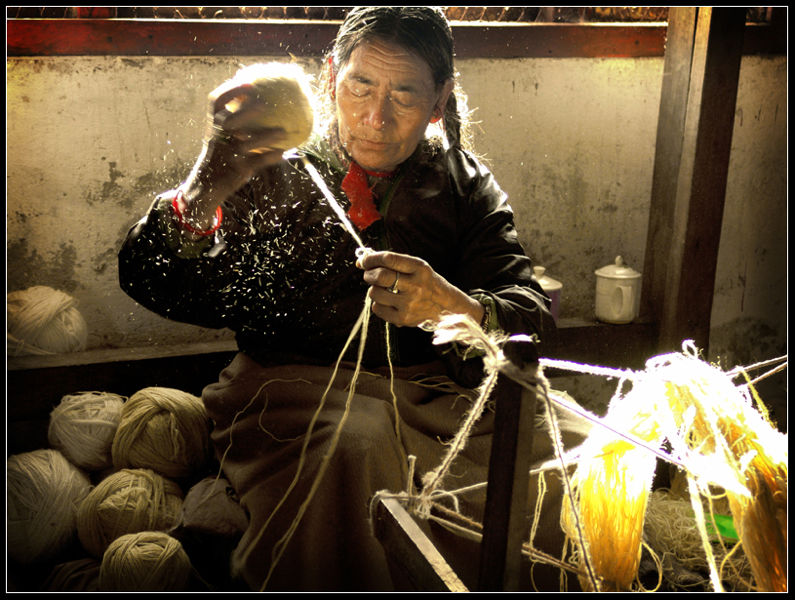
2. Environmental Portrait: I like these two photos because they show these people's environment.

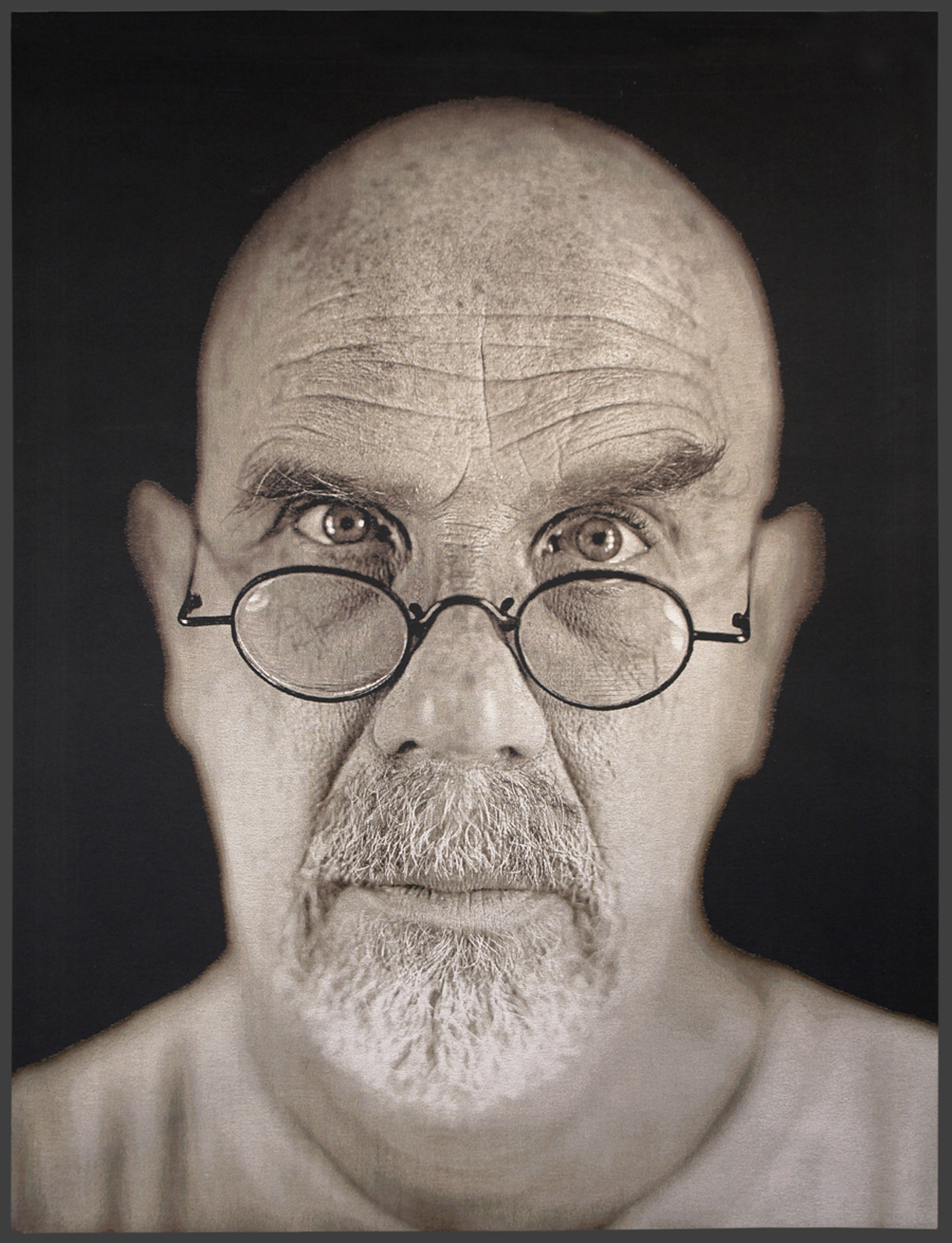
Self-Portrait: I like these two self portraits because they a follow the rules of a self portrait.

Casual Portrait: I like these two casual portraits because they are just casual.


I plan on taking some single person self portraits and making some black and white, or have the person in front of a black background. I also plan to have a group of people and have some in black and white and in front of a black background.
2. Environmental Portrait: I like these two photos because they show these people's environment.


Self-Portrait: I like these two self portraits because they a follow the rules of a self portrait.


Casual Portrait: I like these two casual portraits because they are just casual.


I plan on taking some single person self portraits and making some black and white, or have the person in front of a black background. I also plan to have a group of people and have some in black and white and in front of a black background.
Love and Lost
1. I felt sad because it showed a story of how his wife had cancer and what she had to go through.
2. I think that comment means those pictures are serious and they have to go through it.
3. Yes, but it would be hard for me if I was in the husbands position to see my wife go through these tough times.
4. I would say, i'm sorry for what she is going through and that I will pray for her.
2. I think that comment means those pictures are serious and they have to go through it.
3. Yes, but it would be hard for me if I was in the husbands position to see my wife go through these tough times.
4. I would say, i'm sorry for what she is going through and that I will pray for her.
Wednesday, December 2, 2015
American Soldier.
A: I think the strongest photo out of the slideshow is the picture of the soldier walking to the plane with his bag because I think he is about to go into a mission.
B: The photos were taken in the Army Barber Shop, Army Base, Army Training, Army Mission, and the Army Airport.
C: I think the most powerful set of pictures are the pictures while he was at war.
D: All of these pictures tell the story of his Army experience.
E: The verbs are in Past Tense.
F: The captions enhance the photos by painting an image before the reader even reads the story.
G: 1. Ian joined the Army and was stationed in Iraq, he fought in war ad came home a new man.
2. His motivation was that he was a bad kid and he wanted to change.
3. Some problems he encountered were that he didn't salute the Officer correctly.
4. His fighting habit.
5. He proposed to his girlfriend.
6. Ian became a strong man.
Blog #4
Early Magazine Covers: Some attributes of the early magazine covers are that they have a table of contents and interesting things already on the cover.
The Poster Cover: An attribute about having a poster cover is that the picture paints what the magazine is gonna be about. It can help the reader tell if it will be an interesting magazine.
Pictures Married to Type: An attribute about having pictures married to type is that the picture on the cover goes or fits well with the cover.
In the Forest of Words: An attribute to having a cover In the Forest of Words is having the specific person(s) that fit the magazine topic.
Blog #3
I think this picture fits Bill Murray well because he is funny and in this picture he is acting funny. I also like the lighting in this as well. One thing the photographer could've done better is to have him in a white shirt to contrast better with the black head dress.
Monday, November 30, 2015
Blog #2
1. Formal
2. Environmental
3.Environmental
4. Informal
5. Informal
6.Informal.
7. Informal
8. Informal
9. Informal
10. Informal
11. Informal
12. Informal
13. Informal
14. Informal
15. Informal
16. Formal
17. Informal
18. Informal
2. Environmental
3.Environmental
4. Informal
5. Informal
6.Informal.
7. Informal
8. Informal
9. Informal
10. Informal
11. Informal
12. Informal
13. Informal
14. Informal
15. Informal
16. Formal
17. Informal
18. Informal
Blog #1 Magazine Tips
1. Print several copies of similar photos.
Keep the six functions of covers.
Always judge your cover.
Don't judge your cover.
Sneak your cover onto newspaper stands at drugstores and supermarkets.
Keep the six functions of covers.
Always judge your cover.
Don't judge your cover.
Sneak your cover onto newspaper stands at drugstores and supermarkets.
Monday, November 2, 2015
Rules Of Photography Part II
Topic: Cars.
1. Rule of Thirds. 

2. Balancing Elements. 

3. Leading Lines. 

4. Symmetry and Patterns. 

5. Viewpoint. 

6. Background. 

7. Create Depth. 

8. Framing. 

9. Cropping. 

10. Mergers.
Africa and Abandoned Theme Parks.
AFRICA:
1. I noticed that all of Nick Brandt's photos are in black and white. I also noticed that all of his photos have a central focus. I also noticed that all of his photos have animals in them.
2.

1. I noticed that all of Nick Brandt's photos are in black and white. I also noticed that all of his photos have a central focus. I also noticed that all of his photos have animals in them.
2.

3. I like this picture by Nick Brandt because it hits you in the heart and gives you warm feelings.
4. Rule of Thirds is used in a lot of Nick's photos. Rule of Thirds in when the subject(s) are in a top third or bottom third of a picture.
5. Nick uses a Pentax 67II.
6. He doesn't want to have any action or drama in his photos.
7. He is trying to admire the beautiful animals.
8. "Across the Ravaged Land"
ABANDONED THEME PARKS:
1. I would like to go to Spreepark in Berlin, Germany because it has a lot of sculptures and wacky things. I would like to go here because I want to take a picture of one of the sculptures in front of a sunset or the moon on a clear night.
2. 

3. Seagaia Ocean Dome, Pink Lake Australia, Jetsetta, Alta Igloo Hotel, Lovers Tunnel.
4. Seagaia: 

It would be fun to document this location because it seems like a fun place with lots of action. I would try to get pictures with water frozen in the air with someone splashing around in the water.
Pink Lake Australia: 

It would be fun to document this location because it would be cool seeing a natural pink lake and take pictures of it. I would like to take pictures of the sun with the pink lake and pictures of the water splashing.
Jethouse: 
It would be fun to document this location because this person transformed this wrecked jet into a house. I would take pictures of the jet with a sunset/sunrise in the background or a picture inside of the house.
Alta Igloo Hotel: 

It would be fun to document this location because it is a hotel made of ice. Yes it would be cold, but it would also be cool. I would take pictures of big rooms with dim light, or small rooms with dim light because it would be cool how the light would reflect off of the ice.
Lovers Tunnel: 

It would be fun to document this location because the trees have grown to enclose this path. I would take pictures of the sun coming through the tree leaves or people walking down the path.
Thursday, October 29, 2015
Funny Captions
1. This is Jen and Jim happily racing by the sea wall to the nearest gas station on July 4th to get the same lottery ticket they do everyday.
2. To get here Jen and Jim were fueling up at home and Jim realized he was late to get his lottery ticket so he was all like "JEN!!!! we need to go to the gas station now!!!!" So Jen and Jim got on their 4WD, 600 HP scooters and raced to the gas station.
1. This is Patricia at her local bar waiting for her favorite NFL team to play in the SuperBowl on SuperBowl night because her favorite team (Cowboys) is in the SuperBowl.
2. To get here, Patricia was at her barber the day before SuperBowl Sunday getting her hair dyed as the NFL logo. She said that she would pay any price for this logo dyed into her hair because her team was in the SuperBowl. The next day, she was at her local bar at 5:30 AM getting hyped for the SuperBowl later that night.
1. This is Larry and his dog Poncho, and they are sitting on the back porch mid-day because it's Poncho's birthday and Poncho doesn't wanna get up for a special lunch Larry fixed for him.
2. Larry got Poncho on his birthday 2 years before and Poncho has become super lazy since he was adopted.
Tuesday, October 13, 2015
Aperture, Shutter Speed, and ISO
APERTURE:
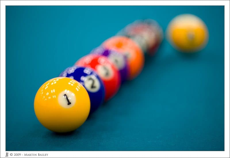
F2.8-
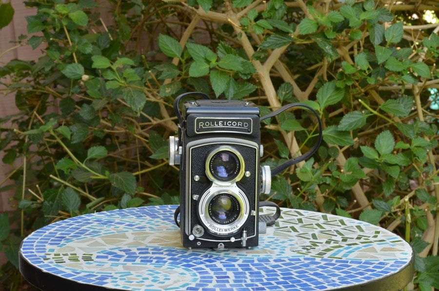
F16-
1. We should relate the pupil to aperture.
2. The smaller the aperture the larger the f-number, the larger the aperture the smaller the f-number.
3. Smaller aperture will bring the foreground and background in focus.
SHUTTER SPEED:


Reasonable Sunlight.
1A. Slow shutter speed.
1B. Slow shutter speed.
1C. Fast shutter speed.
1D. Fast shutter speed.
1E. Fast shutter speed.
1F. Fast shutter speed.
No Sunlight.
1A. Fast shutter speed.
1B. Fast shutter speed.
1C. Fast shutter speed.
1D. Fast shutter speed.
1E. Fast shutter speed.
1F. Fast shutter speed.
2. Aperture Priority, Shutter Priority, Manual.
ISO:

ISO 200.

ISO 3200
1. The picture will be more clear.
2. Use when there is good light present.
3. Use when there is not good light.
DSLR Camera.
1. The aperture settings go from 2.5 to 22.
2. The shutter speed settings go from 1sec to 1/4000 sec.
3. The ISO settings go from 100 to 25,600.
F2.8-

F16-

1. We should relate the pupil to aperture.
2. The smaller the aperture the larger the f-number, the larger the aperture the smaller the f-number.
3. Smaller aperture will bring the foreground and background in focus.
SHUTTER SPEED:


Reasonable Sunlight.
1A. Slow shutter speed.
1B. Slow shutter speed.
1C. Fast shutter speed.
1D. Fast shutter speed.
1E. Fast shutter speed.
1F. Fast shutter speed.
No Sunlight.
1A. Fast shutter speed.
1B. Fast shutter speed.
1C. Fast shutter speed.
1D. Fast shutter speed.
1E. Fast shutter speed.
1F. Fast shutter speed.
2. Aperture Priority, Shutter Priority, Manual.
ISO:
ISO 200.

ISO 3200
1. The picture will be more clear.
2. Use when there is good light present.
3. Use when there is not good light.
DSLR Camera.
1. The aperture settings go from 2.5 to 22.
2. The shutter speed settings go from 1sec to 1/4000 sec.
3. The ISO settings go from 100 to 25,600.
Friday, October 9, 2015
Academic Shoot Reflection and Critique
1. Some challenges that I encountered while shooting were focusing on the subject.
2. I was thinking the most about leading lines and Rule of Thirds. I think that I used the stair railing as good leading lines and I tried to put the girl at the bottom of the stairs in the Rule of Thirds.
3. If I could shoot again, I think that I would focus the picture better.
4. Some things that I would keep doing is using the stair railing as leading lines.
5. I think that Rule of Thirds will be the easiest to achieve because I myself can move around to make the subject become Rule of Thirds.
6. I think the hardest rule to achieve would be framing just because it always turns out that the prompt calls for something that is tough to frame.
Someone Else's Blog.
http://douglasphotojournalismblog.blogspot.com/2015/10/academic-shoot-photos.html
I really like his photos because they are really focused really well, and it looks like the took his time while taking these photos. I also like his photos because they all have good color in them.
One thing that he could improve is to take darker pictures.
Academic Shoot Photos
1. I used leading lines in this photo.
2. The subject is Art.
3. Somewhat yes.
4. I could've gotten closer and focused better.
1. I used leading lines in this photo.
2. The subject is Reading.
3. Yes.
1. I used Rule of Thirds in this photo.
2. The subject is Art.
3. No
4. I could've gotten closer.
1. I didn't really use a rule of composition in this photo.
2. The subject is art.
3. Yes.
Thursday, October 1, 2015
Unusual and Interesting Photos Part 3
1. I think the 3 most important suggestions for photographers are to take a picture with someone smiling in it, take a photo of a lot going on, and to have a good light source.
2.
3.

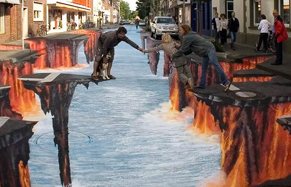
4. I think that the photographer did follow the suggestion fully.
5. I really want to go find one of these street illusions and try this suggestion.
2.

3.

4. I think that the photographer did follow the suggestion fully.
5. I really want to go find one of these street illusions and try this suggestion.
Unusual and Interesting Photos Part 2

1. I like this photo because Robert Griffin III is in mid-air trying to score a touchdown.
2. I found this photo in the Sports Action - SPA category.
3. This photo won 3rd place in the Sports Action - SPA category.
4. The photographer caught Robert Griffin III in mid-air and that attracted my eyes.
5. I think that this photo was on the judges mind so high up because of the hi-def quality of the photo.
6. I think that the photographer took a burst of photos.

1. I like this photo because it has 2 main subjects.
2. I found this photo in the Feature Single - FET category.
3. This photo one 1st place in the Feature Single - FET category.
4. The space ship in the back ground attracted my eyes first, then the 2 kids were second.
5. I think that this photo was on the judges mind so high because it has 2 main subjects.
6. I think that the photographer was at the right place at the right time.

1. I like this photo because it is of one my favorite NFL teams.
2. I found this photo in the Sports Feature - SFF category.
3. This photo won the 1st place prize in the Sports Feature - SFF category.
4. This photographer attracted my eyes by having Justin Perillo in the picture with all the fans.
5. I think the judges had this photo ranked 1st because it is funny, and high quality.
6. I think that the photographer followed Justin Perillo when he jumped up into the stands.
Unusual and Interesting Photos Part 1
1. I think that his work is really cool because it kind of looks like a kaleidoscope picture.
2. I think he made these photos by moving the camera really fast.
3. I think that the empire state building would be a cool building to take this kind of picture. I think that I would have to fly to NY to get this kind of photo of the Empire State Building.
2. I think he made these photos by moving the camera really fast.
3. I think that the empire state building would be a cool building to take this kind of picture. I think that I would have to fly to NY to get this kind of photo of the Empire State Building.

Friday, September 25, 2015
Next Shoot Answers.
1. I think that I will go into a classroom while a fun educational activity is going on.
2. I would wanna go into a science class room or an art room.
3. I will try to keep the camera level and still for a good focused picture.
2. I would wanna go into a science class room or an art room.
3. I will try to keep the camera level and still for a good focused picture.
My Favorite Photo Answers.
I picked the photo with the girl in the background with pink paint flying everywhere.
1. I picked this photo because I thought it was cool how the photographer caught the paint in mid air.
2. Some rules of photography are cropping, and leading lines.
The Story, Action and Emotion, Filling the Frame
"The Story"
I think the photo with the best story is the photo with the 2 girls and the substance in mid air. (a.k.a. first place) I think the story is they dropped something in to the glass causing it to explode.
I think the photo with the best story is the photo with the 2 girls and the substance in mid air. (a.k.a. first place) I think the story is they dropped something in to the glass causing it to explode.
"Action and Emotion"
I think the best picture that shows emotion or action is the picture with the circle of people around the pole. When I see this picture I think that they are praying.
"Filling The Frame"
I think that the picture with the kids putting their hands in the middle of the table shows filling the frame because the kids are all around the picture.
Subscribe to:
Comments (Atom)
